Graphics that mean stuff
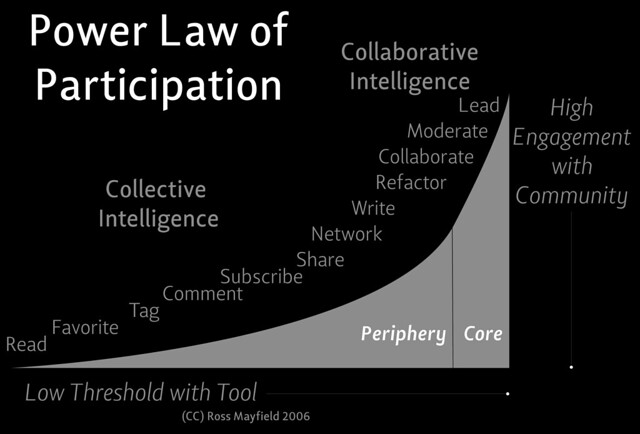
I came across the following graphic in this week's Change 11 topic, titled "Power Law of Participation"
Now...don't get me wrong, I love visualizations as much as the next learner, but visualizations need to mean something. Even context-less they need to be somewhat decipherable and viewers need to be able to infer some meaning. This isn't the case with this image. What is this "Power Law"? What do the axes mean? What is measured? How is it measured? Why is it measured?
Who determines the periphery and the core? What are the criteria for inclusion or exclusion? What tool is being talked about?
Perhaps there is some more in the readings, but given that this was provided as a link (and not embedded in the reading text), I am not sure if it is :-)
Image URL: http://www.flickr.com/photos/ross/541707092/sizes/z/in/photostream
Now...don't get me wrong, I love visualizations as much as the next learner, but visualizations need to mean something. Even context-less they need to be somewhat decipherable and viewers need to be able to infer some meaning. This isn't the case with this image. What is this "Power Law"? What do the axes mean? What is measured? How is it measured? Why is it measured?
Who determines the periphery and the core? What are the criteria for inclusion or exclusion? What tool is being talked about?
Perhaps there is some more in the readings, but given that this was provided as a link (and not embedded in the reading text), I am not sure if it is :-)
 |
| Ross Mayfield (CC) |


Comments
Participation” I ended up (after only 2 or 3 random links) at an article by
zeynep http://technosociology.org/
that actually contains some interesting observations. The article itself
appears to have nothing to do with the Power Law but would have been lost to me
had I assumed nothing but crap would follow the initial discovery of crap. Can it be that crap is a natural byproduct of us all trying to be too rational?